There’s a reason so many people end up staying in the Shuswap. Whether it’s the mist lifting off the water in Blind Bay or those long summer afternoons in Scotch Creek, the landscape tends to stick with you.
When it comes to interiors, the best homes don’t compete with that—they take cues from it. If you’re planning a renovation or a new build in Sorrento, Celista, or Salmon Arm, your paint palette plays a big role in how the space will feel day to day.
To help narrow things down, we’ve put together a “Warm Modern” palette based on what we see around the lake.
The Driftwood Neutral
Inspired by the Narrows
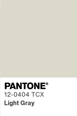
We’re moving away from the colder greys that were popular for a while. Warmer neutrals are taking their place. This is what people call “greige,” but with a more natural feel.
This works well as a main colour. It keeps the space comfortable in the winter and still looks clean and bright through the summer.
The Shale Cliff
Inspired by the rock faces of the shoreline

Every home needs a bit of contrast so it doesn’t feel flat. This is a deep charcoal with some cooler undertones, similar to what you see along the shoreline on an overcast day.
It’s a good option for things like a kitchen island or a fireplace surround. It adds depth without taking over the room.
The Forest Understory
Inspired by Seymour Arm and Margaret Falls

A muted green, closer to what you see in moss, ferns, and shaded areas of the forest.
Colours like this tend to make a space feel calmer. They work well in bedrooms or offices where you want things to feel a bit more settled and quiet.
The Morning Mist
Inspired by early mornings on Shuswap Lake

A sharp white can feel a bit out of place in a lake home. A softer white is usually the better choice.
This kind of tone works just about anywhere. It still looks clean, but it has enough warmth to keep the space from feeling stark—especially during the darker months.
The Final Touch: The Warmth of Wood
Paint sets the base, but wood is what brings everything together.
For a lighter look, white oak or birch pairs well with the driftwood tones and softer whites. If you want more contrast, natural cedar or walnut works nicely against the darker greys and greens.
It doesn’t need to be complicated—just keep the materials in line with what you’d naturally see around here.
Are you planning a project in the Shuswap this year? These colors and textures are a great place to start, but the best designs always come from a vision that’s as unique as your specific lot.